Project Case Study - Family Home in Castle Hill
The project brief
My clients for this project were a young family with a new baby. They came to me having seen my work on social media and were looking to renovate a home they had purchased in the Sydney suburb of Castle Hill. They had seen my Roseville project (see images of this popular project over on the portfolio page!) and were keen to replicate the same sort of aesthetic in their own renovation. They particularly liked the style of the kitchen.
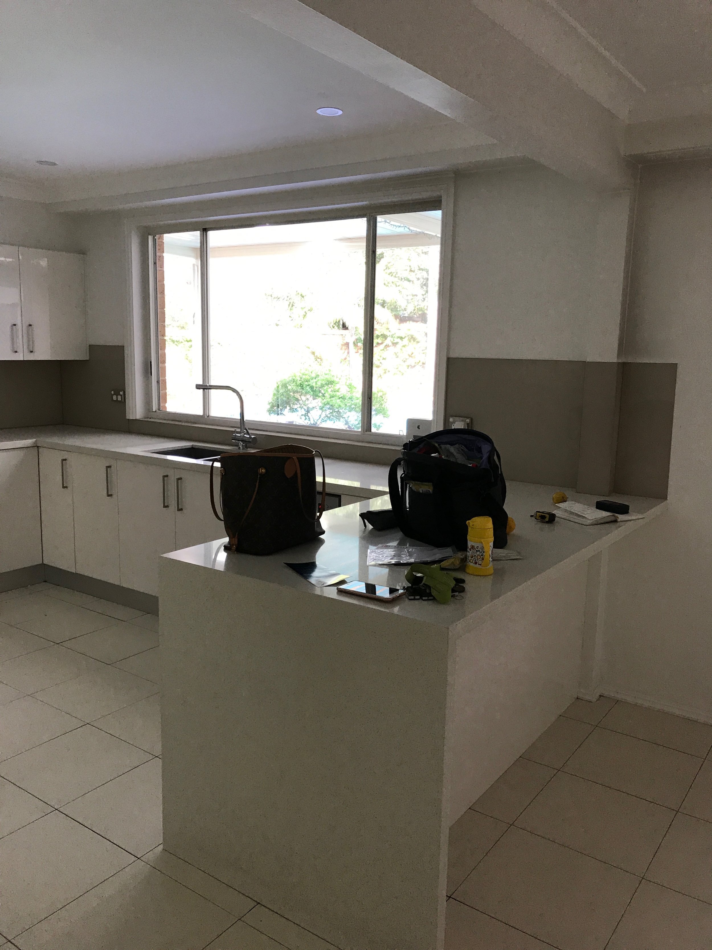
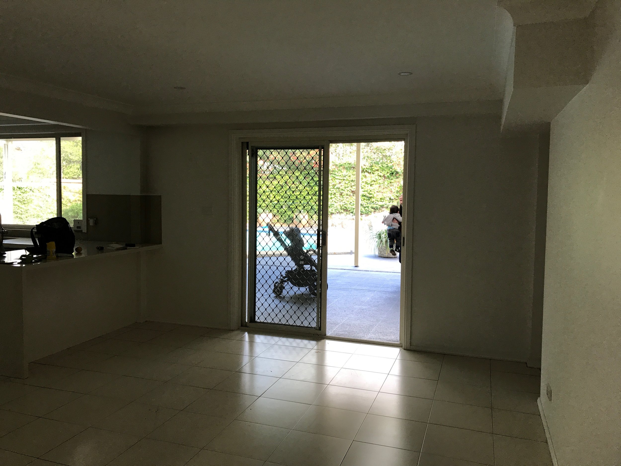
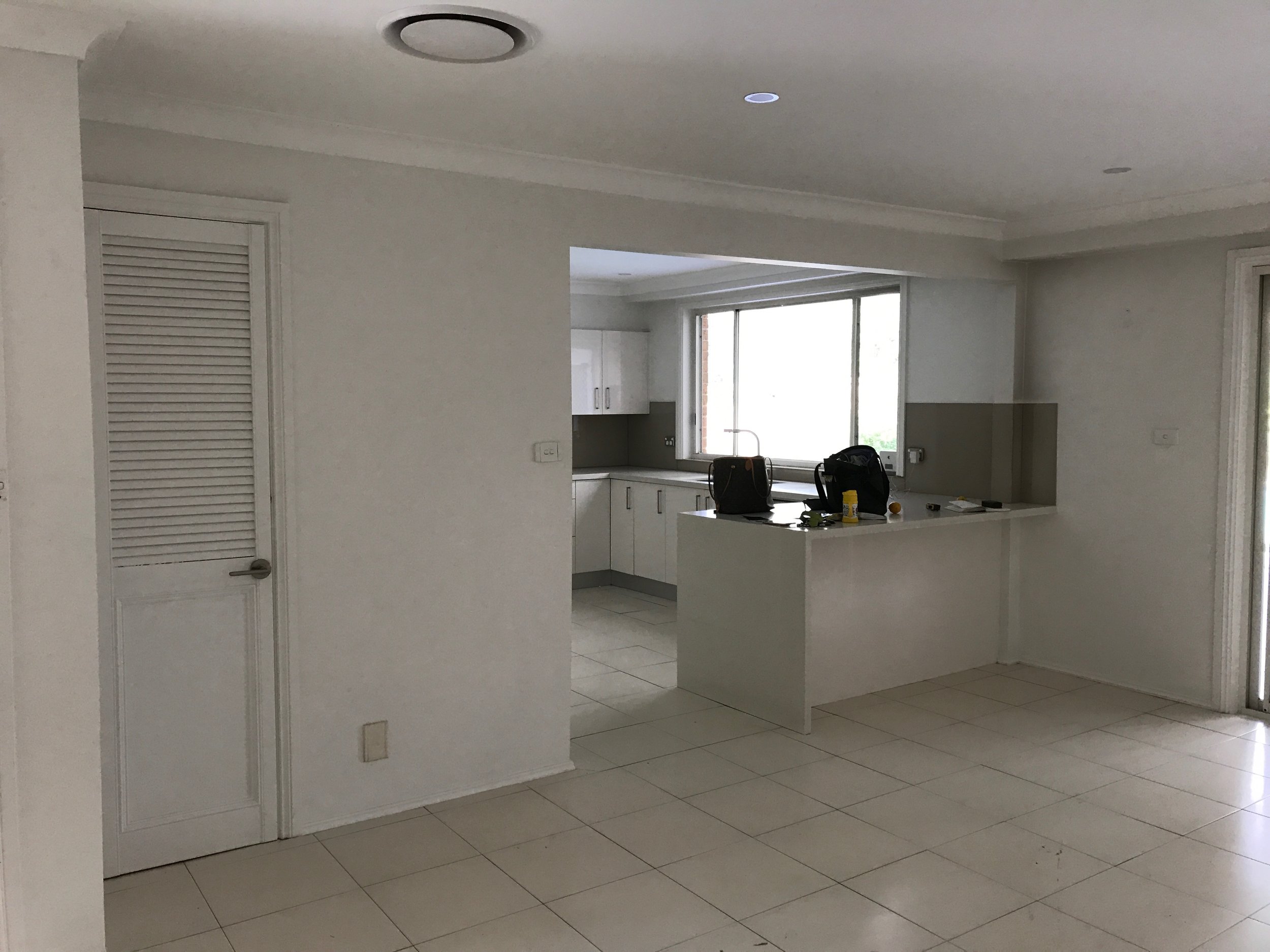
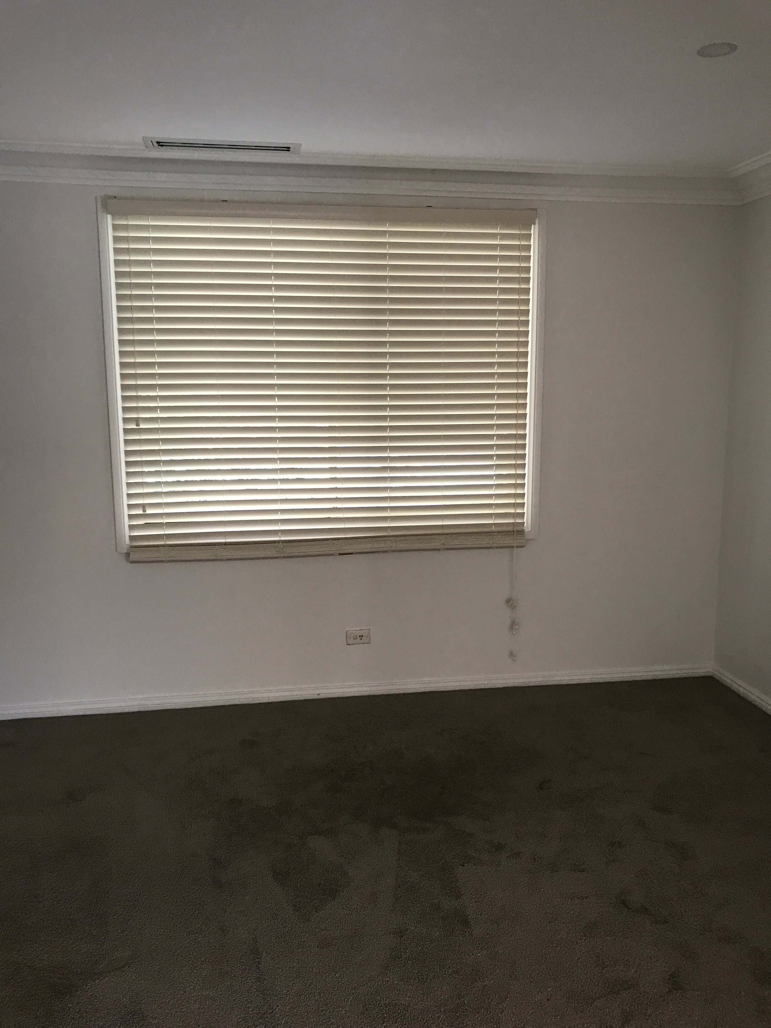
Before Photos and Floor Plan
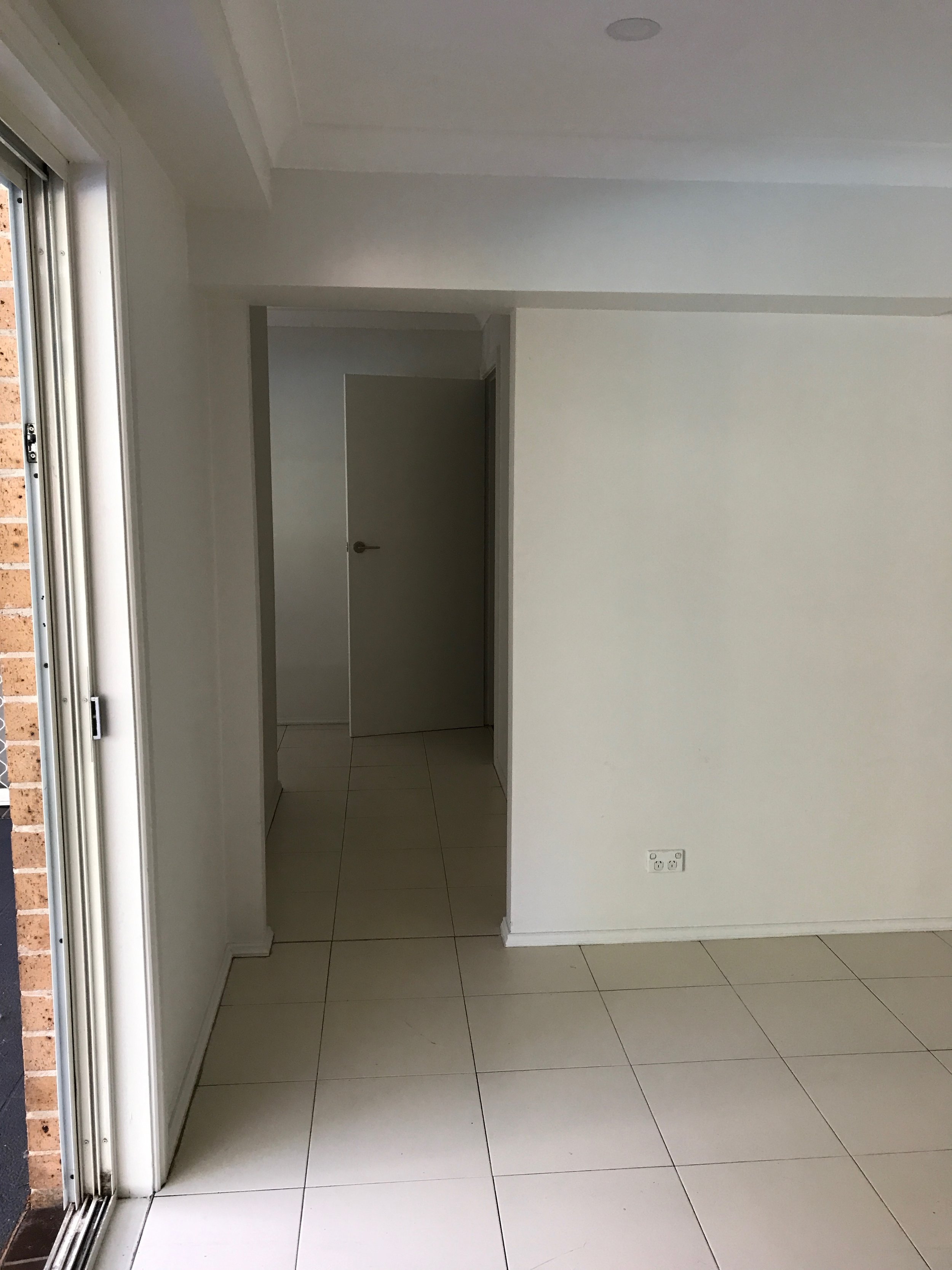
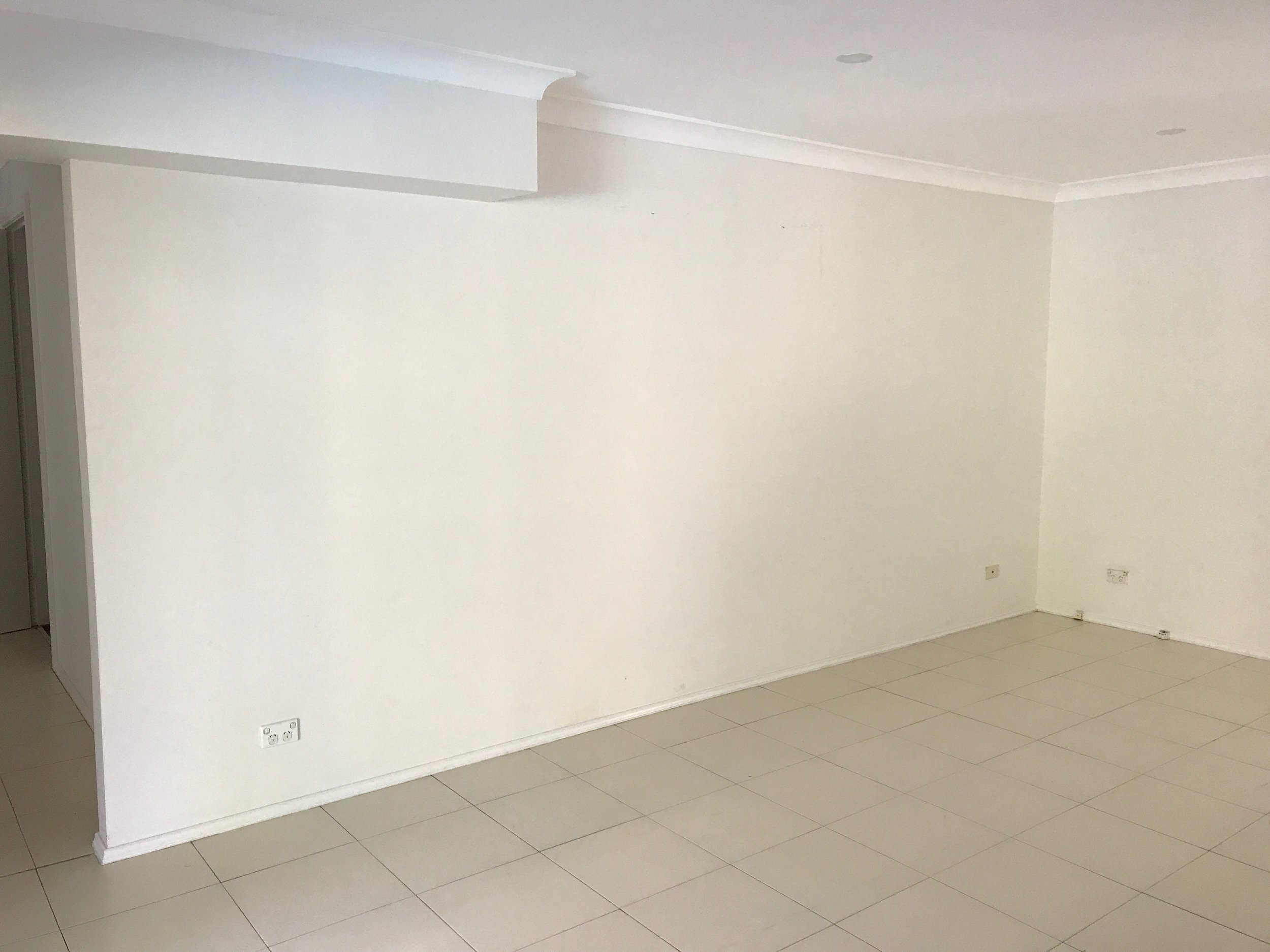
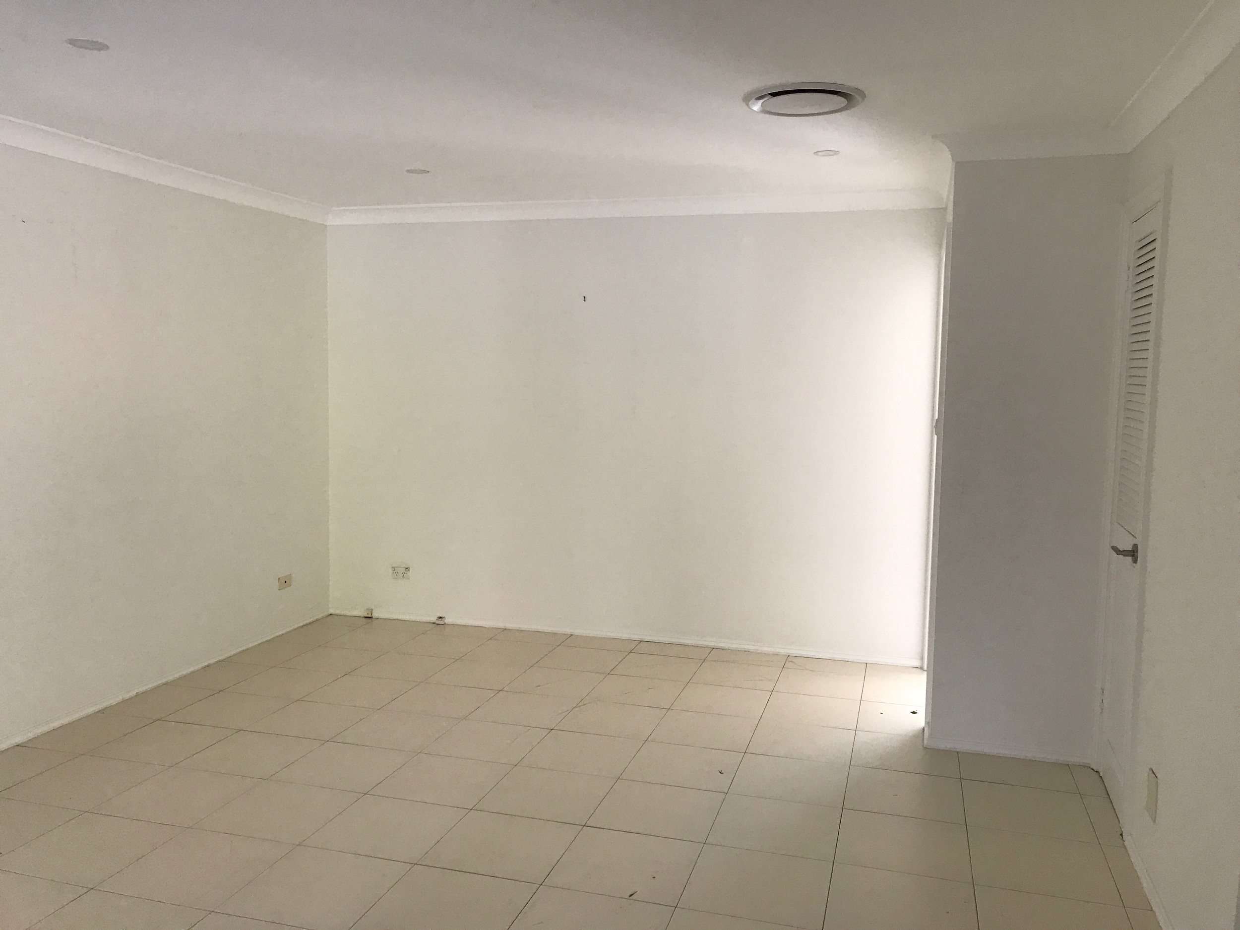
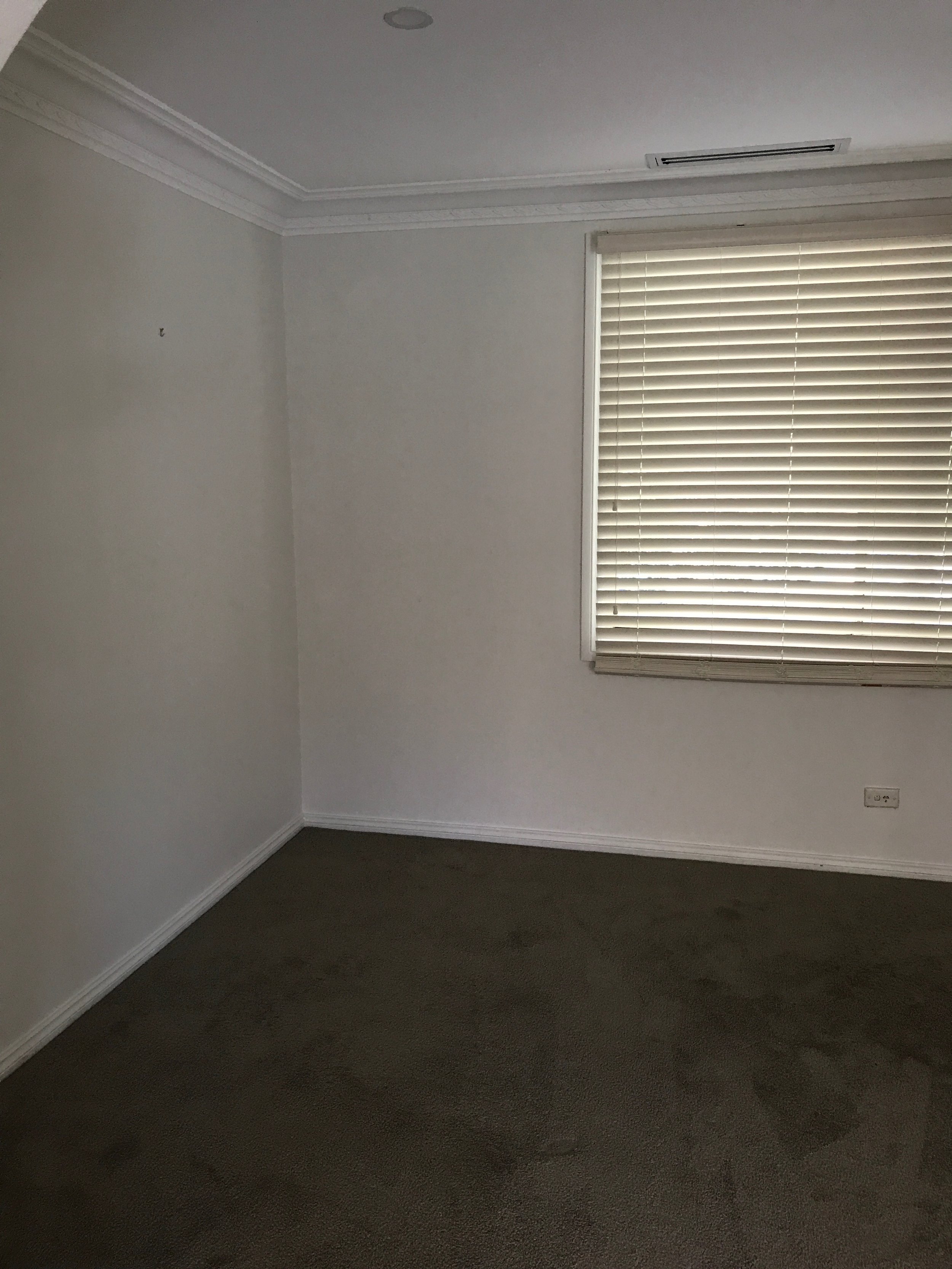
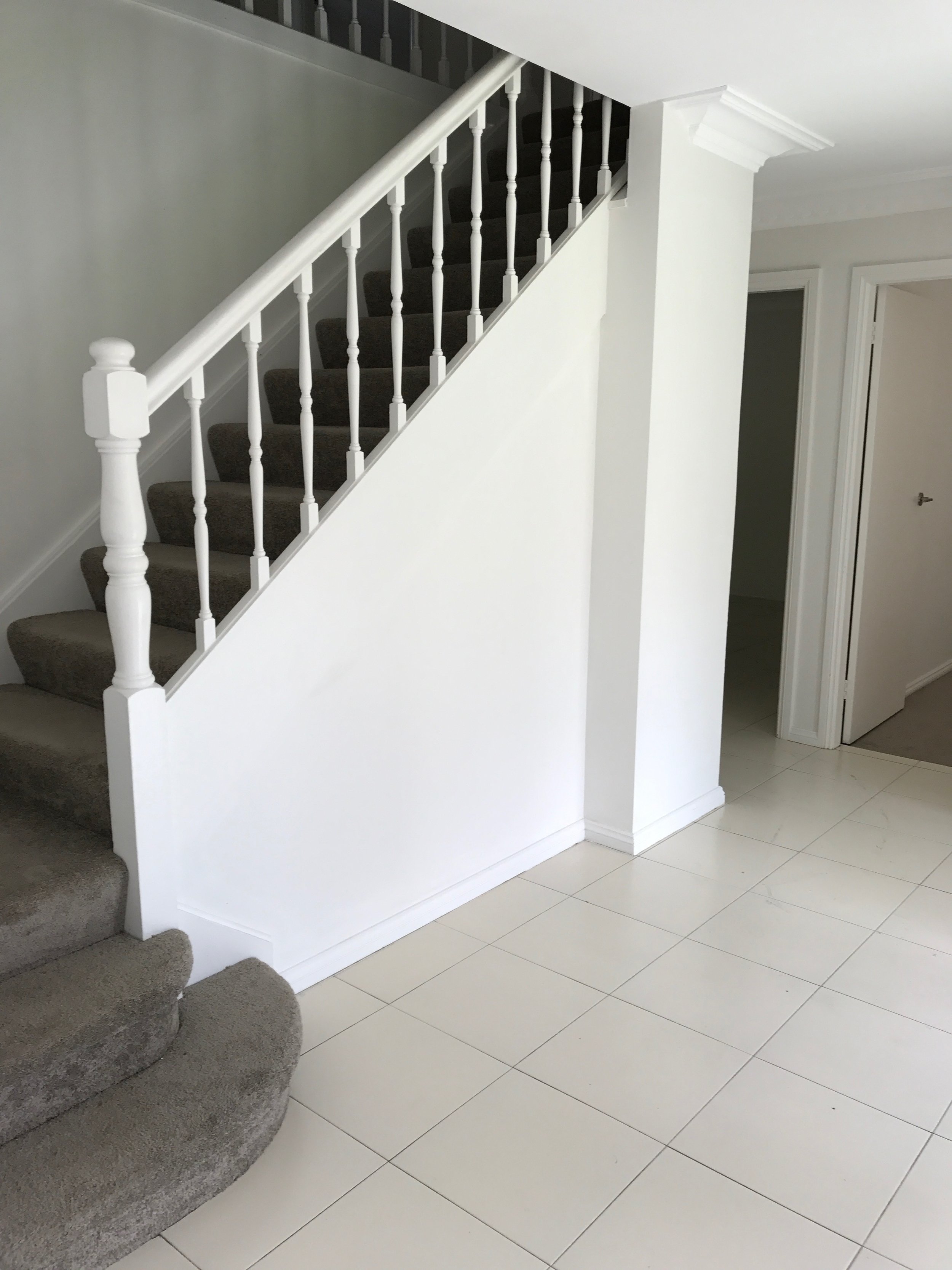
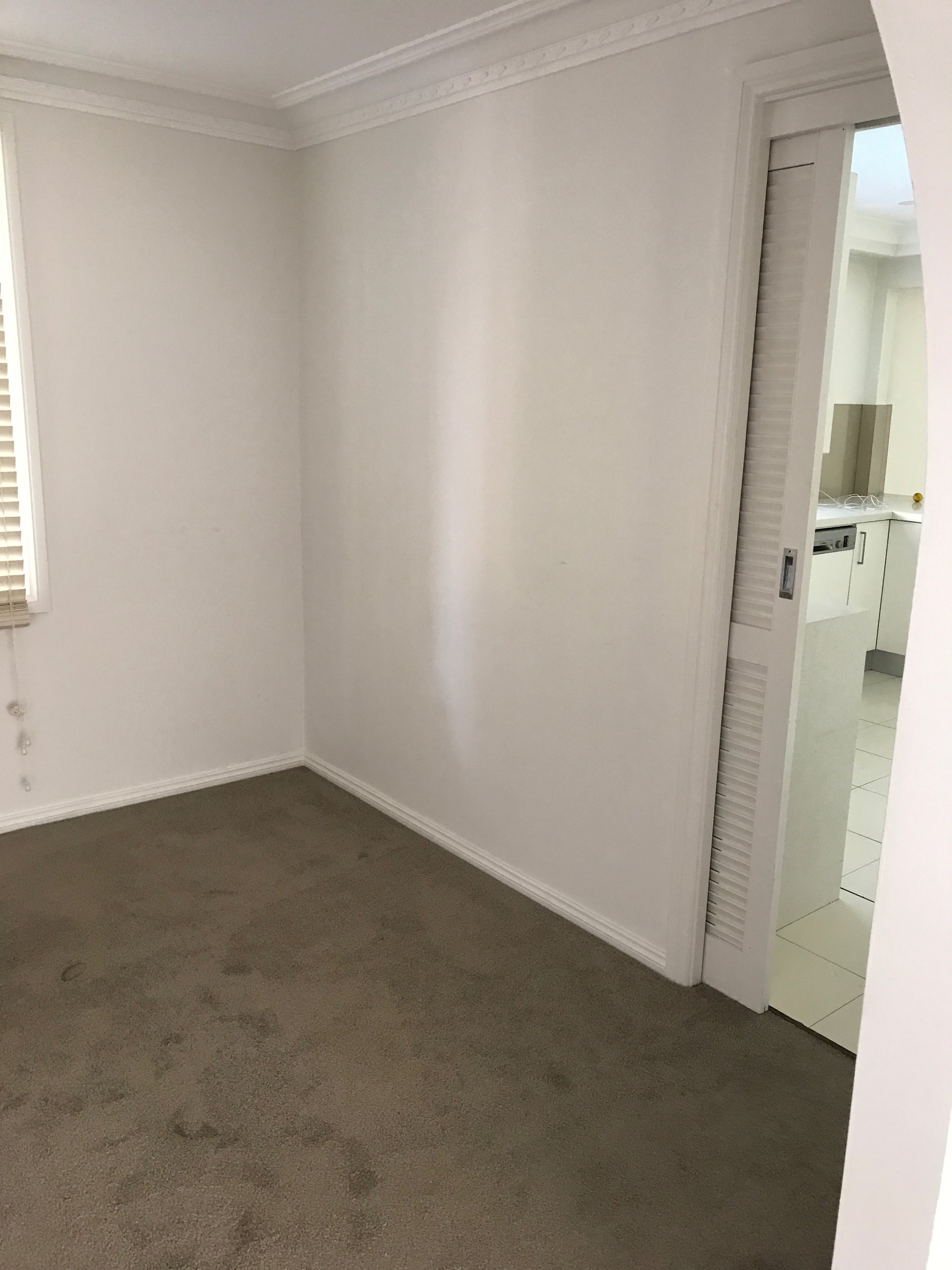
The house was about a 1990s/early 2000s new build and had fairly uninspiring internal details or architecture so we had to create some interest with the new design. It had a fairly typical floor plan for a house of its era with bedrooms upstairs and living spaces downstairs. The downstairs living spaces were ample with multiple living zones as well as a home office/spare bedroom.
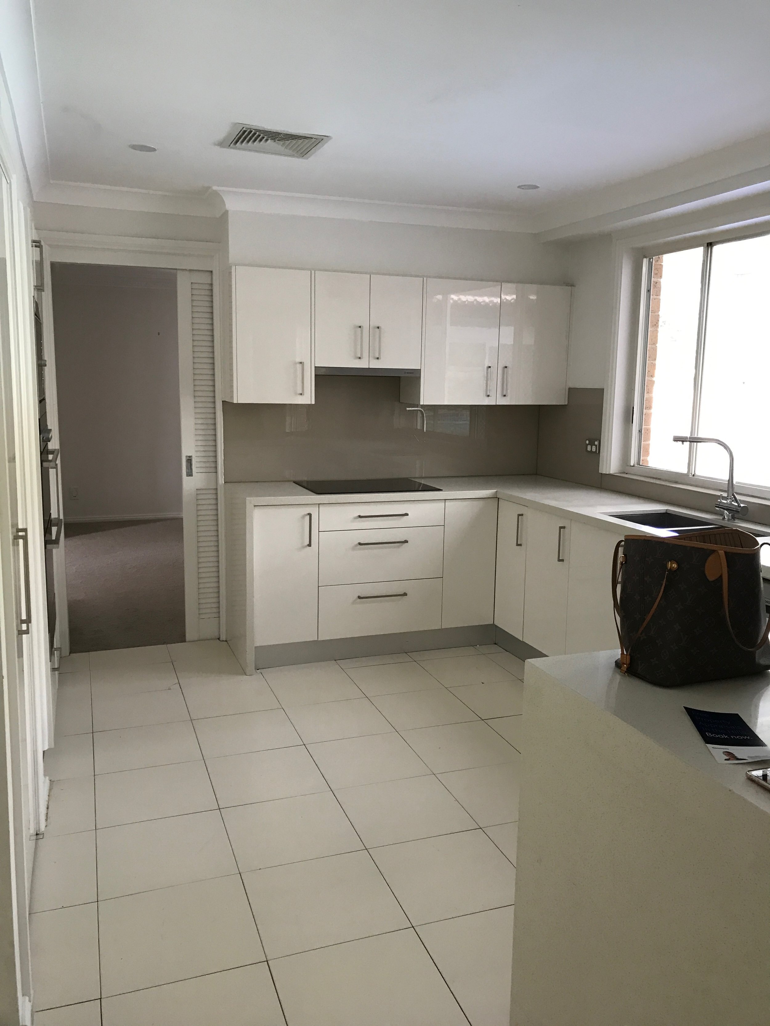
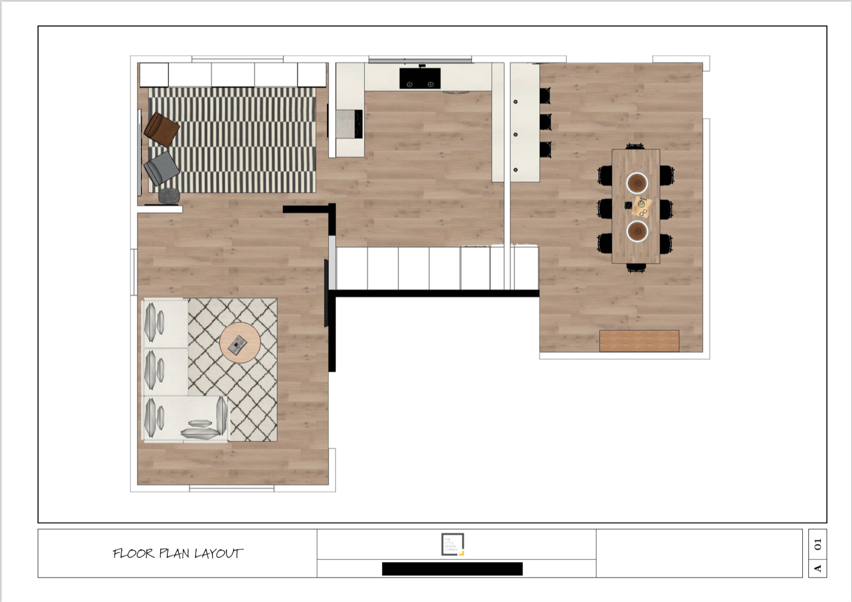
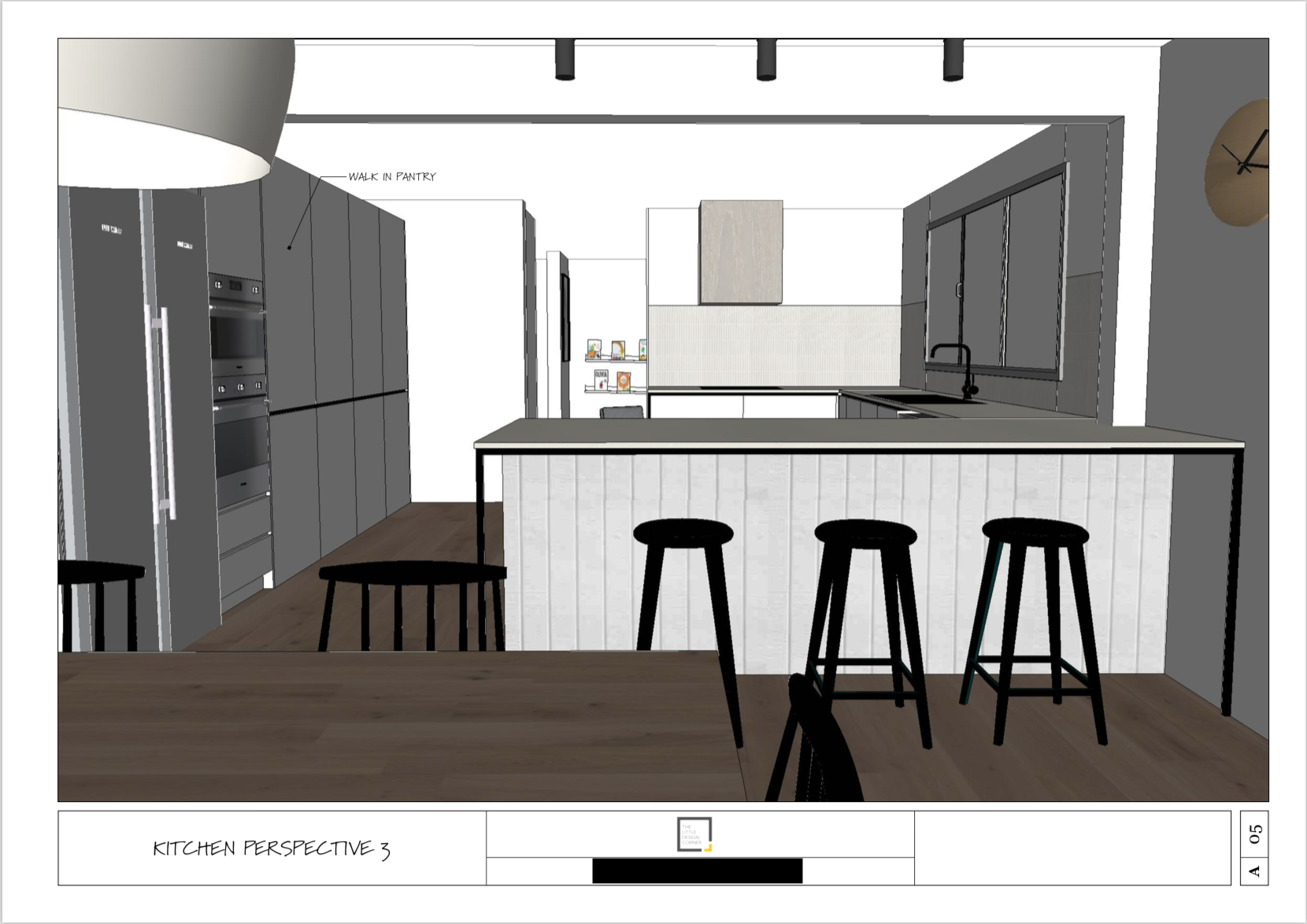
Although there wasn’t much that was wrong with the house and it was certainly still ‘liveable’ my clients were keen to update the design to suit their tastes. The floor plan worked pretty well so very few structural changes were required. The only change that was made was to incorporate the bar area in to the kitchen design to create a large walk in pantry area and knock down the random collection of walls that existed in the kitchen. You can see the new downstairs floor plan in the concept images below.
The floors were typical of that era of build with a mix of (ugly!) tile and carpet. It was fairly dark, partly due to the architecture and poor choices of window dressings and partly to do with the internal colour schemes. The house had lots of brown and beige tones and there was quite a bit of scope for improvement!
The concept drawings
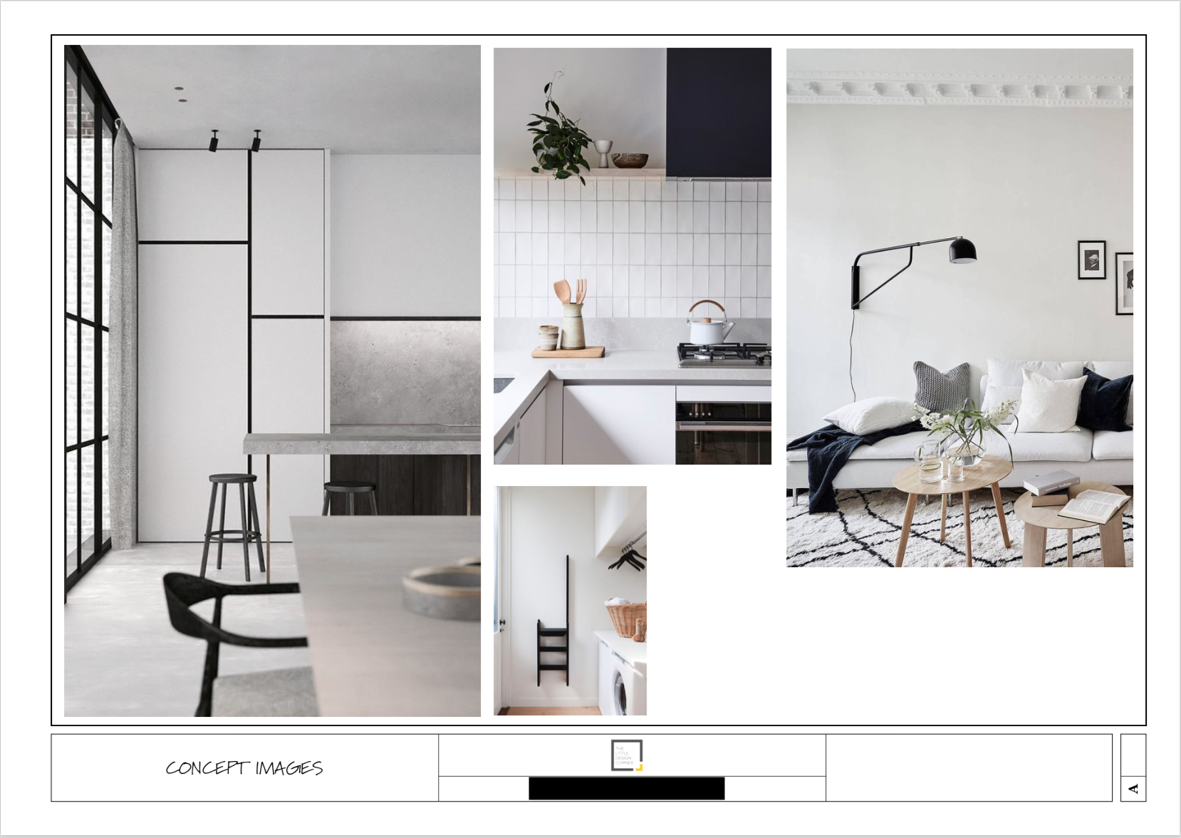
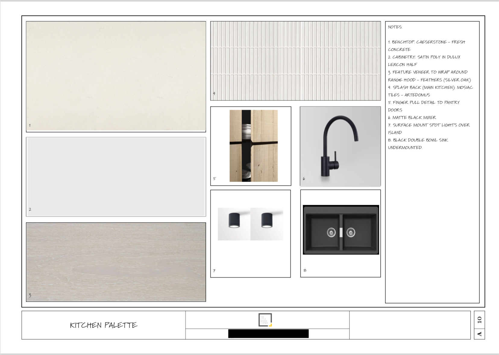
As mentioned, my clients had come to me after seeing my work on my own home in Roseville and were keen to replicate the look and feel of that home in their design. We used my kitchen from Roseville as the jumping off point and I also gathered up some other inspiration images to communicate the look/feel we were trying to go for.
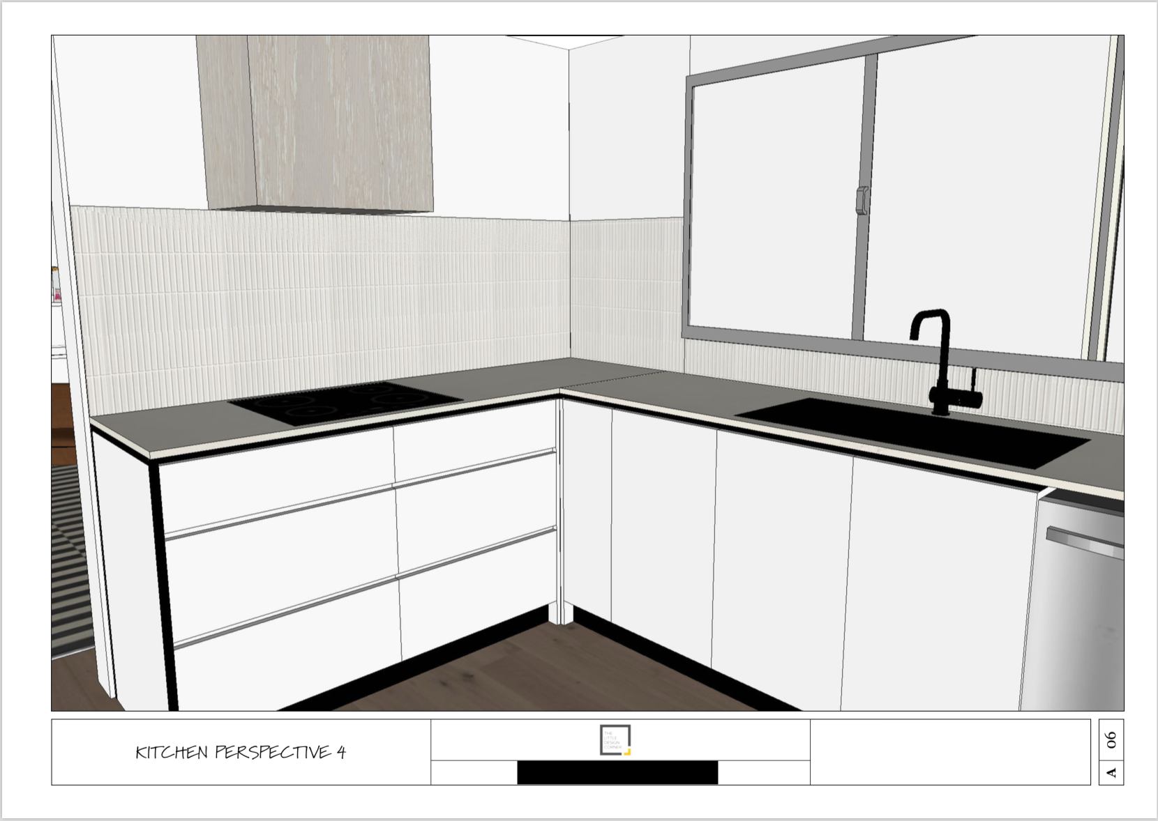
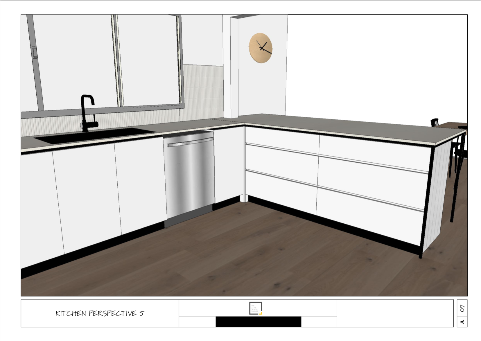
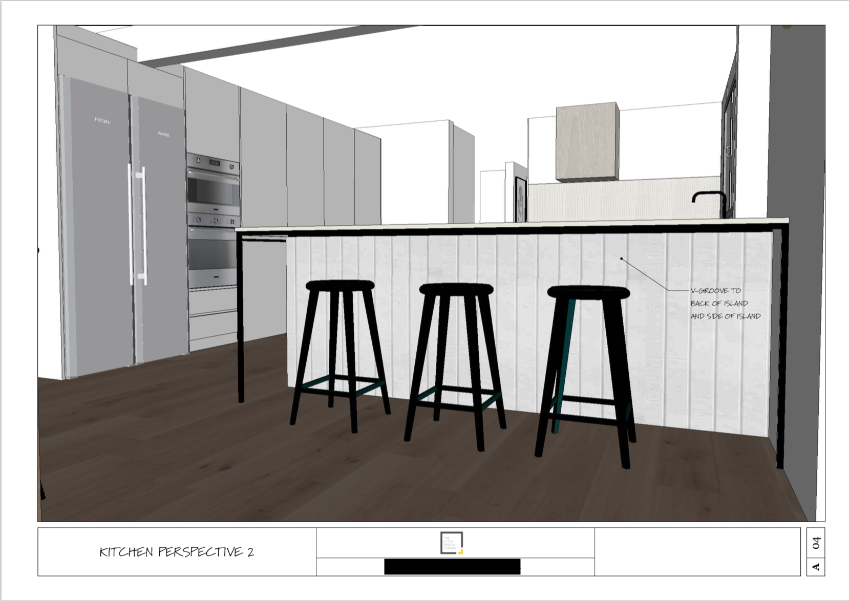
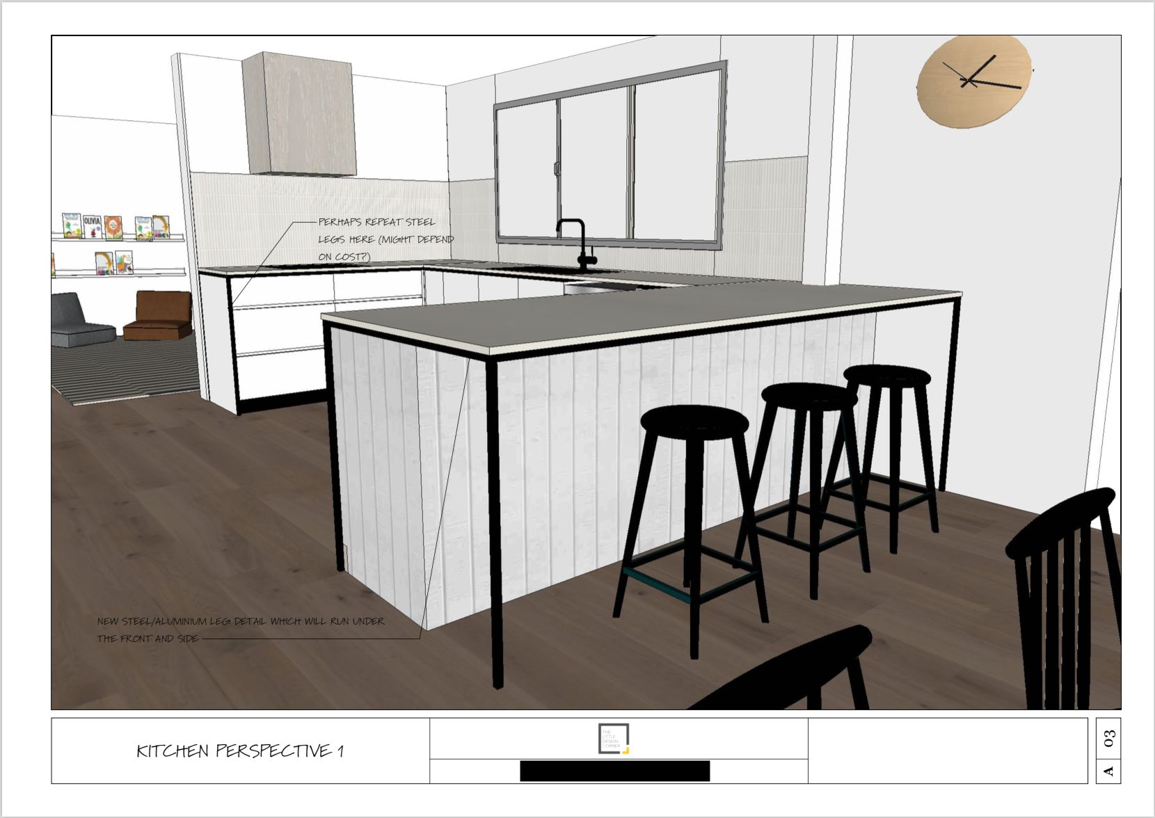
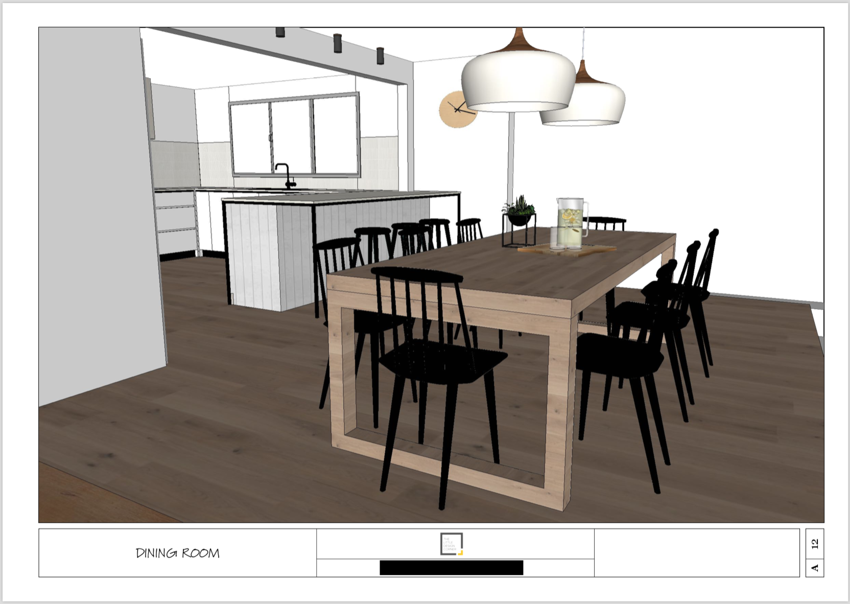
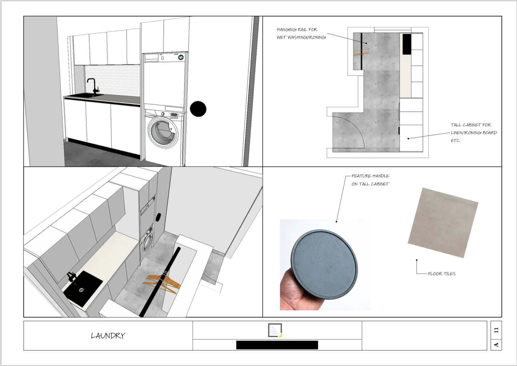
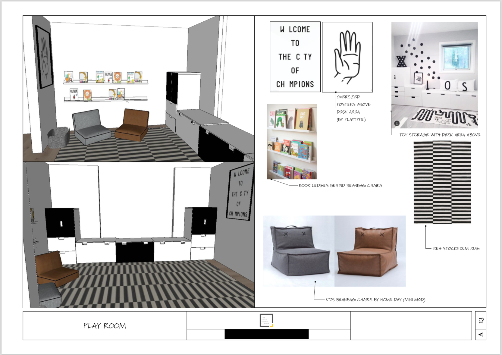
As with all projects I work on, the first step was to create new floor plans and 3D concepts for the design. We focused mainly on the update of the downstairs area due to budget constraints, although in the end my clients ended up renovating most of the home. To start they wanted to lay new flooring throughout, put in a new kitchen and laundry, a playroom for their son, new lounge room and some new joinery in the study.
I developed the concept below for them, which they loved, so we got to work with getting this built.
After Photos
My favourite part of the final project was how the kitchen turned out. The look and feel was quite similar to my home in Roseville but I did do a few different things to mix it up a bit. The black shadow line detail on the kick plates and finger pull were different and this black shadow line detail carried through to the wall of tall cabinetry that housed the fridge, ovens etc. As there was a weird bulkhead in the middle of the island return (that would have been too costly to remove), we opted for a feature wall light instead of pendant light.
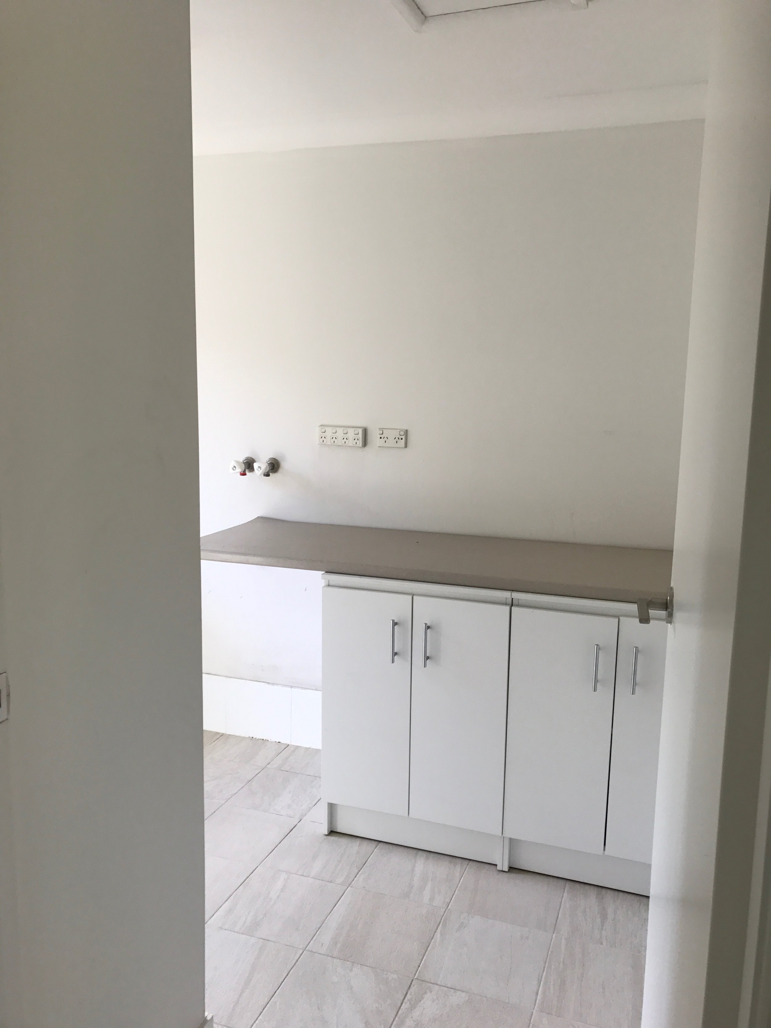
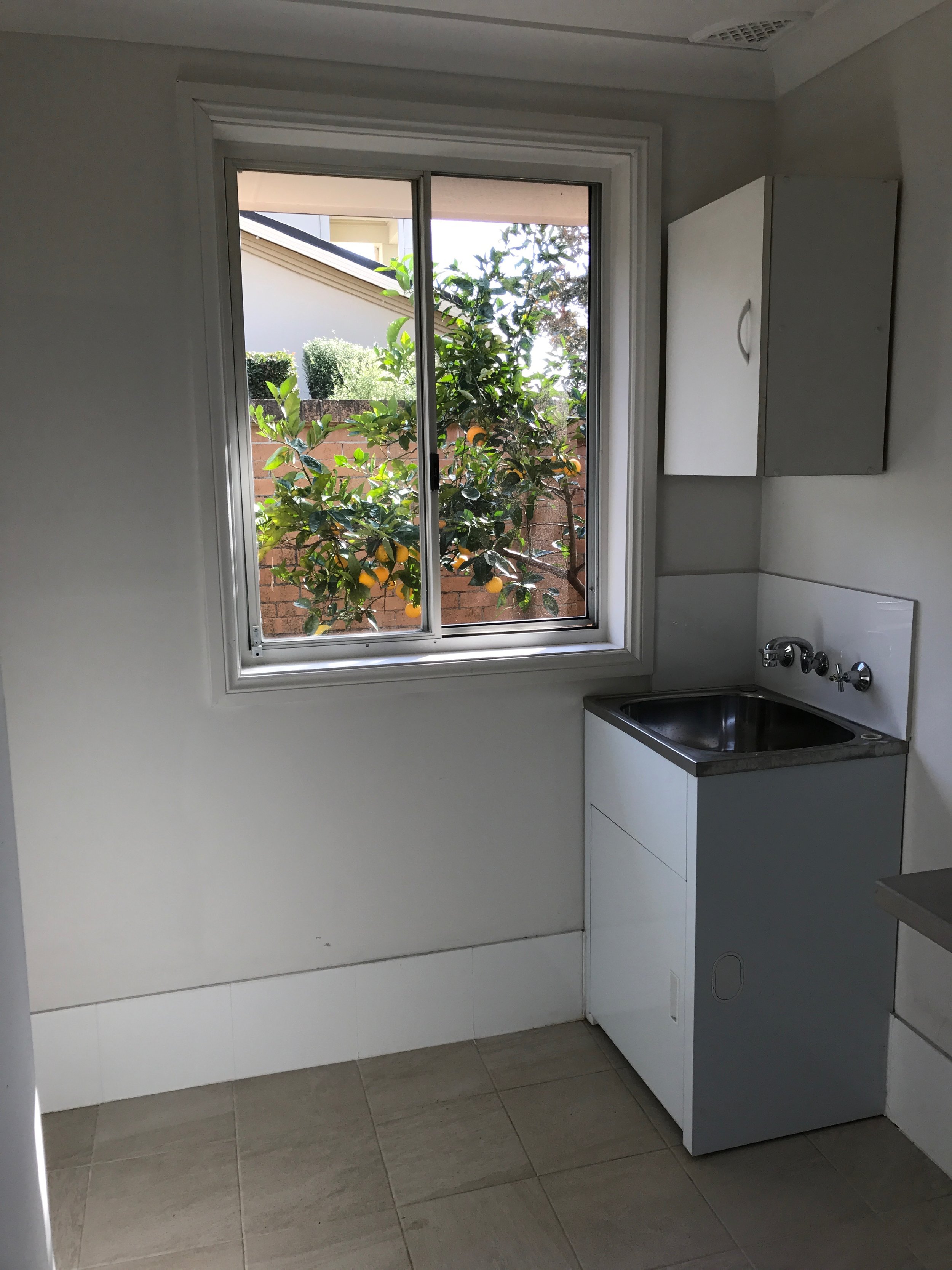
In the laundry we carried the black shadow line detail through and a feature handle from Made Measure made otherwise fairly boring cabinetry look more interesting.
In the living room my clients bought one of the new (at the time!) TVs that looked like a picture frame and created a gallery wall around the TV, which looked pretty cool.
Overall my clients stuck to the design concept pretty much 100% and the results looked fantastic.
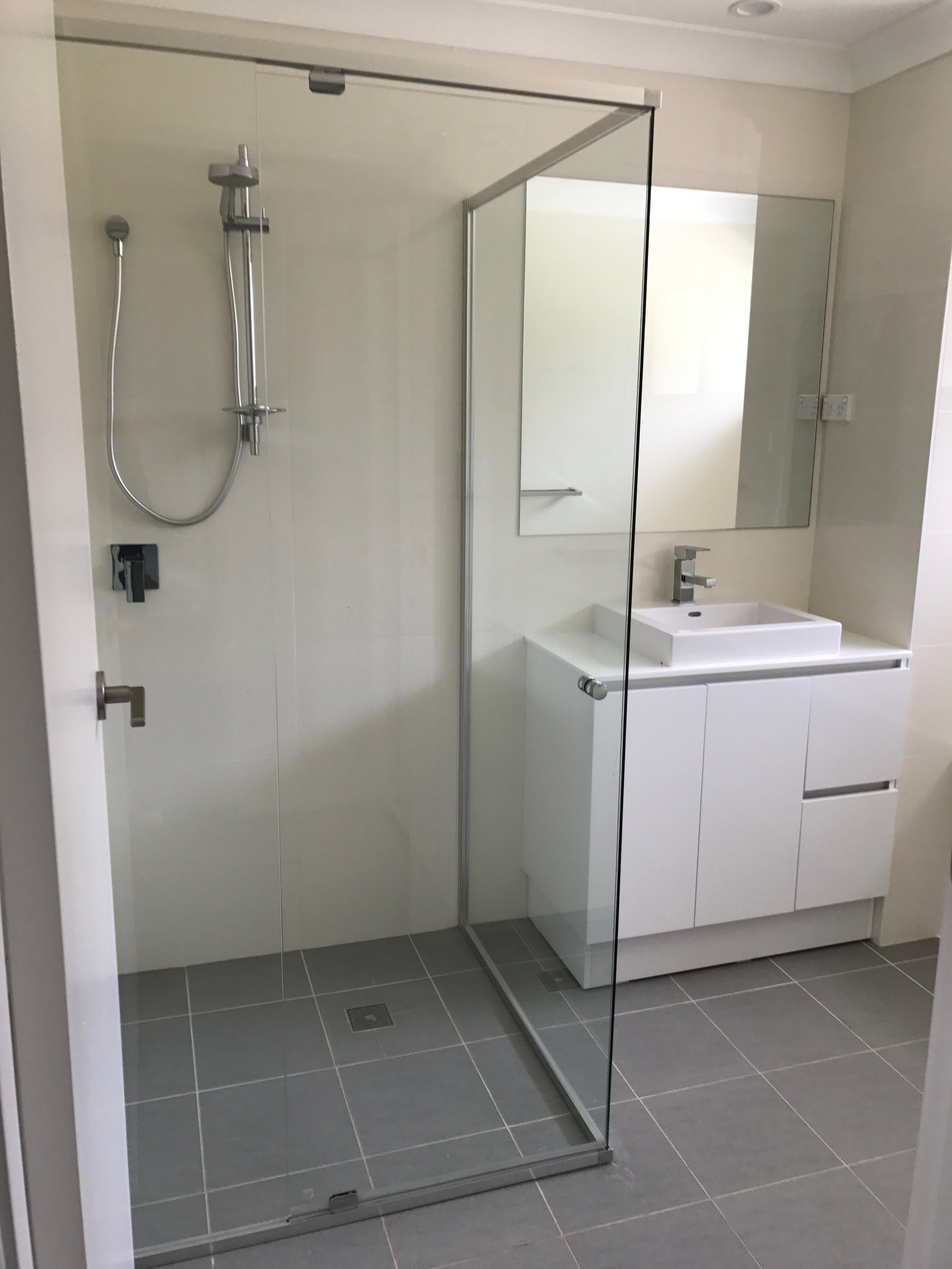
See all the after images below - image credit to my client who took all of these photos. They have since started a homewares brand One Simple Concept which you may like to check out!
Learn SketchUp with our fun online course for beginners…
If you want improve your work with design clients or you are about to start renovating or remodeling then you will love SketchUp.
With this software you can mock up an entire home in 2D (floor plans, joinery/millwork elevations, lighting and electrical plans and more) and 3D (renderings and perspective drawings) so you can picture exactly what it will look like when it is finished plus prepare your technical drawings for use with your clients, trades and contractors.
Learning SketchUp will save you time, money, mistakes and so much more! It is a well known piece of software in the interior design and architecture industries and will give you a solid technical drawing skill that will immediately upgrade the professionalism of the work you are doing.
I teach an online course for beginners that is focused specifically on using SketchUp for interior design purposes. We have had more than 10,000 students come through the course with so many fantastic projects designed and built!
We have all sorts of students in the course including designers and architects, cabinet makers, home renovators/remodelers, kitchen and bathroom designers, event planners, landscape designers and design enthusiasts.
To find out more about the courses we have on offer click the link below. And reach out if you have any questions I can help with :)


